Interstate Access & Employment Growth:
Evidence from a Design-Based Instrument
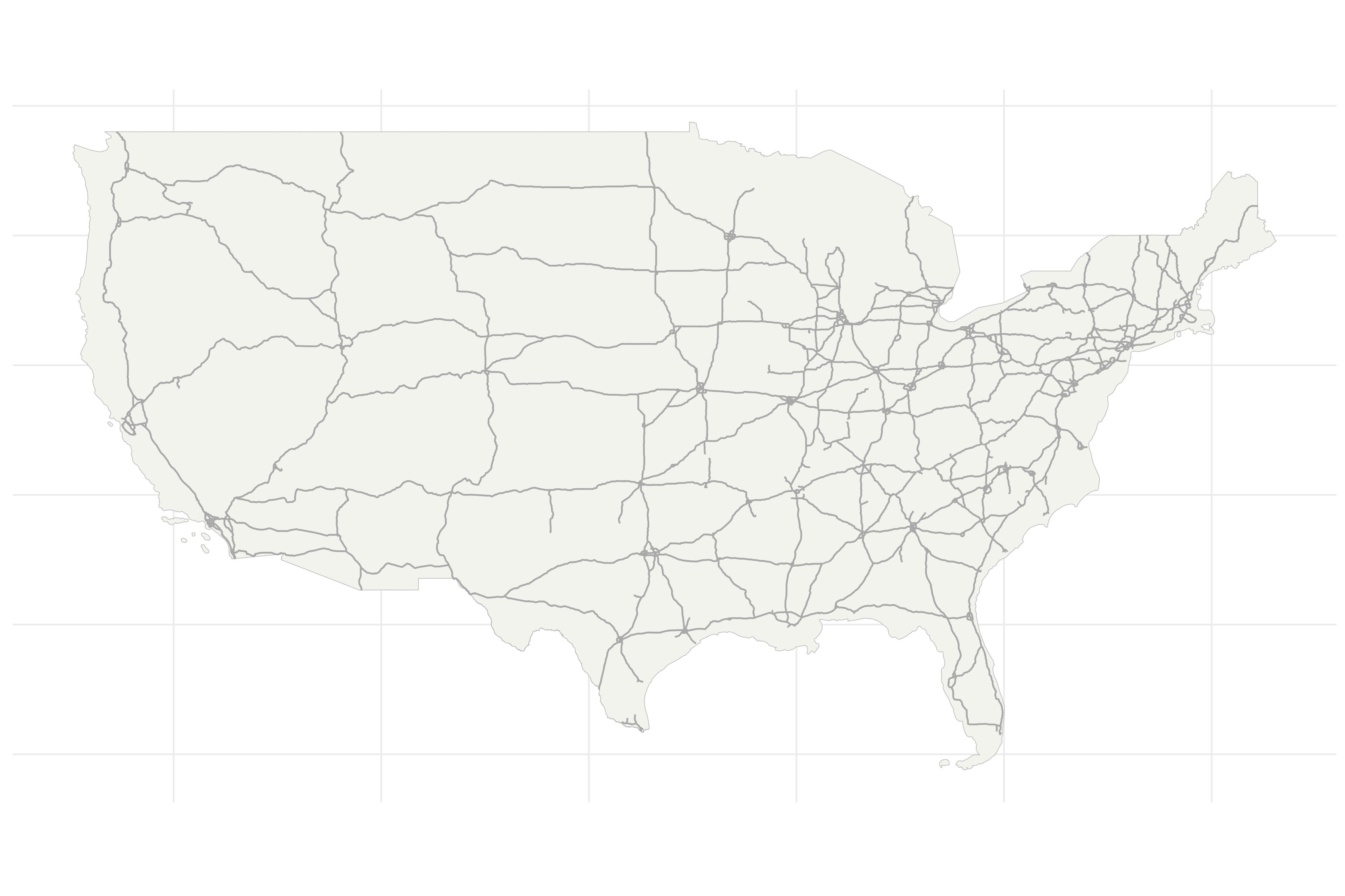
The Federal-Aid Highway Act of 1956 authorized the construction of the 41,000-mile Interstate system. Since then, employment has become increasingly concentrated in counties linked to the network.
These highways, of course, were not placed at random - they were planned to connect large cities. Therefore, this employment growth could be driven by concurrent forces of urbanization, rather than by Interstate access itself.
I develop a new design-based instrumental variable using an overlooked planning quirk that shaped counties’ Interstate access. Leveraging this source of quasi-experimental variation, I estimate the causal effect of Interstate access on county employment growth.
I find that, among counties that as-good-as-randomly gained Interstate access, employment only increased where agriculture was initially important.
 Courtesy of ExxonMobil Corporation
Raw Data & Employment Growth Regression
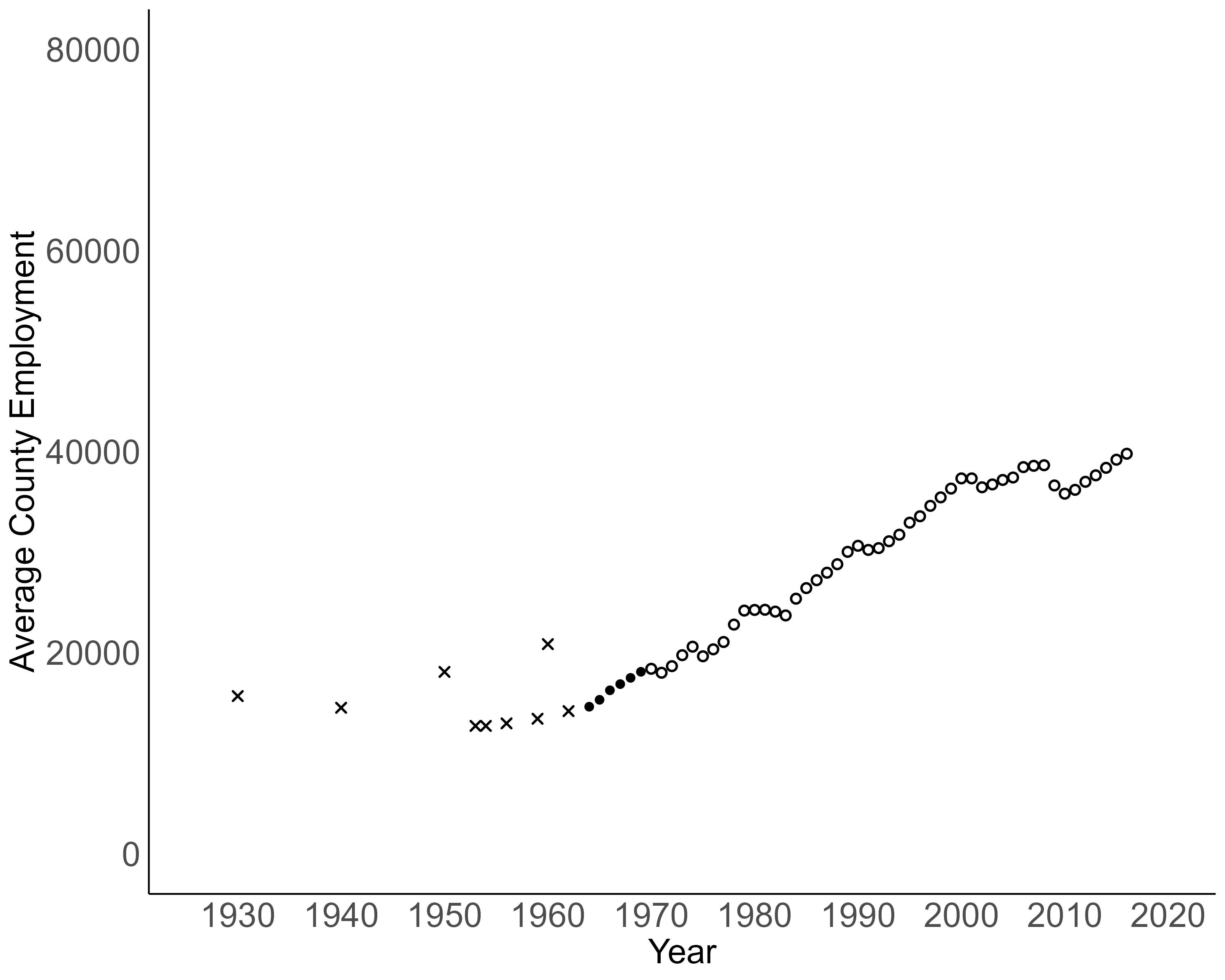
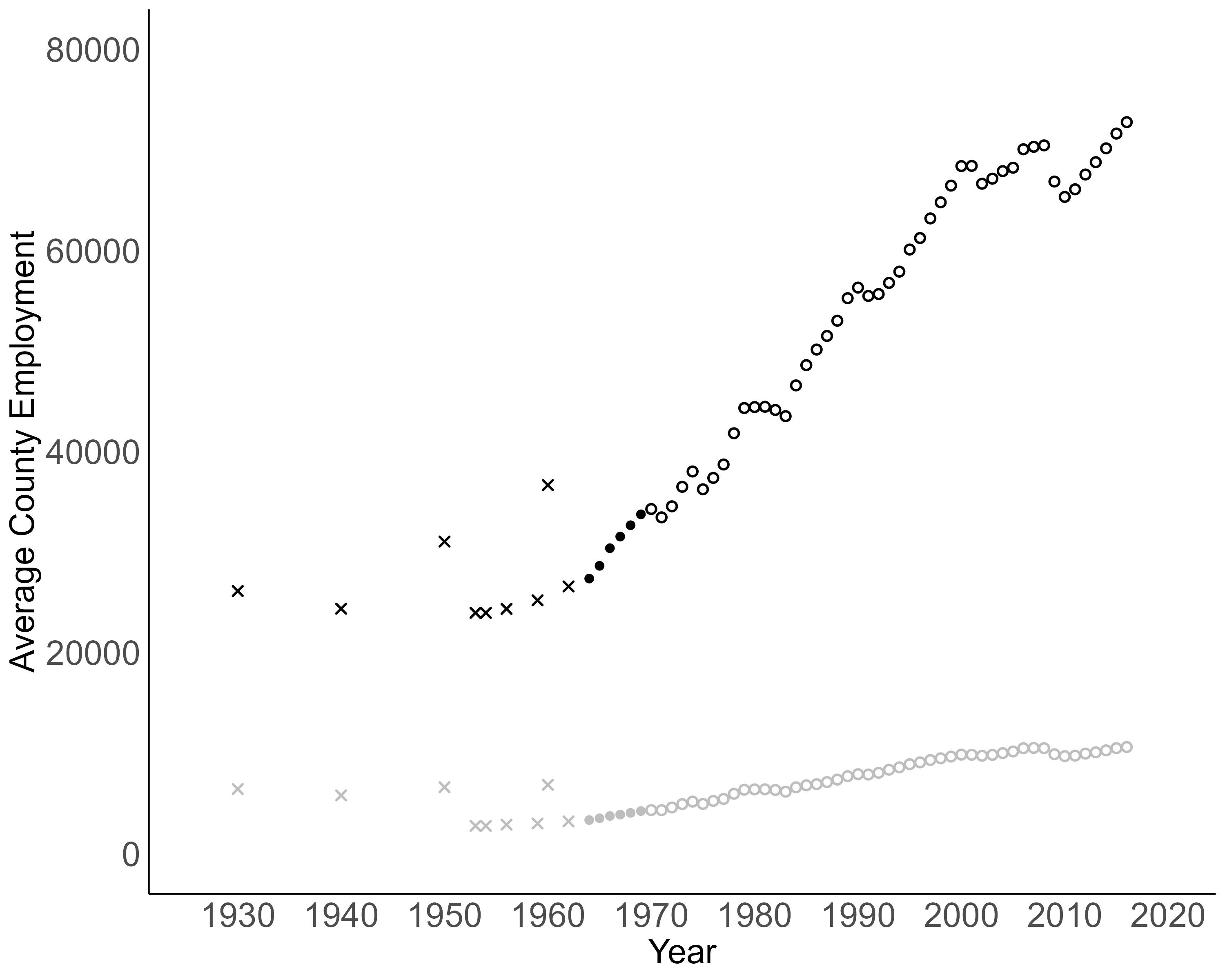
Raw Employment Growth Data
I use a county-level panel of employment counts that Dustin Frye compiled from multiple CBP sources. Points denoted by × are hand-collected from archives, ● are from ICPSR and ○ are from data published by the US Census Bureau.
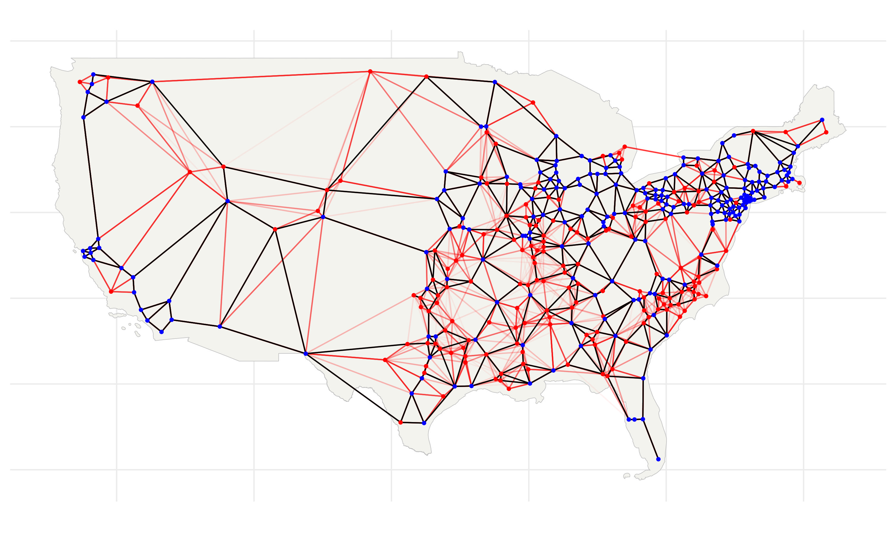
To examine the relationship between employment growth and Interstate access, I split counties into two groups; treatment and control. I classify counties within 25km of an Interstate highway as the treatment group and the remainder constitute the control group.
It looks like most employment growth during the last century was concentrated in the treatment counties. Counties that gained Interstate access experienced exponential-looking employment growth. However, consistent with concerns of selection bias, these counties began with higher baseline employment and were possibly already growing faster.
As a first step, I specify a regression model to capture the divergence between treatment and control counties. In the analysis that follows, I exclude the early outliers from decennial years, which appear inconsistent with other sources.
Growth in County-Level Employment
![]()
Growth in County-Level Employment

Baseline Employment Growth Regression Model
To flexibly capture dynamic effects while preserving statistical power, I group years into 5-year periods, \(\tau \in \{1970\text{-}1974,\,1975\text{-}1979,\,\dots,\,2010\text{-}2014\}\). For each period \(\tau\), I estimate the following specification, with counties indexed by \(c\):
\[ \log(Y_{c, t}) - \log(Y_{c,1953}) = \beta_{0,\tau} + \beta_{1,\tau}\,\text{Treatment}_{c} + X_{c}\gamma_{\tau} + \delta_{t} + \varepsilon_{c, t} \]
The dependent variable is the log change in employment in county \(c\) since 1953. The coefficient \(\beta_{1,\tau}\) measures the relationship between Interstate access and post-construction employment growth at period \(\tau\). The indicator \(\text{Treatment}_{c}\) equals one if county \(c\) was within 25km of an Interstate highway. The vector \(X_{c}\) includes baseline county characteristics measured prior to Interstate construction, and \(\delta_{t}\) denotes year fixed effects.
Constructing an Instrument to Control for Selection
Due to selection bias, OLS estimates of \(\beta_{1, \tau}\) might differ from the causal effect on Interstate access. To address this bias, I find an instrumental variable (IV) for \(\text{Treatment}_{c}\).
That is, I construct a variable that (1) predicts which counties were more likely to receive Interstate access, but (2) is not correlated with underlying location fundamentals or other unobserved factors that shape local labor market growth.
To find such a variable, I turn to the original planning documents to learn how Interstate routes were chosen. From this, I develop a model that predicts where routes were planned and isolate the component that is uncorrelated with counties’ potential outcomes.
So, with that, let’s look more closely at the planning documents. How did planners actually decide on these routes? And was any part of that process exogenous to counties’ employment growth?
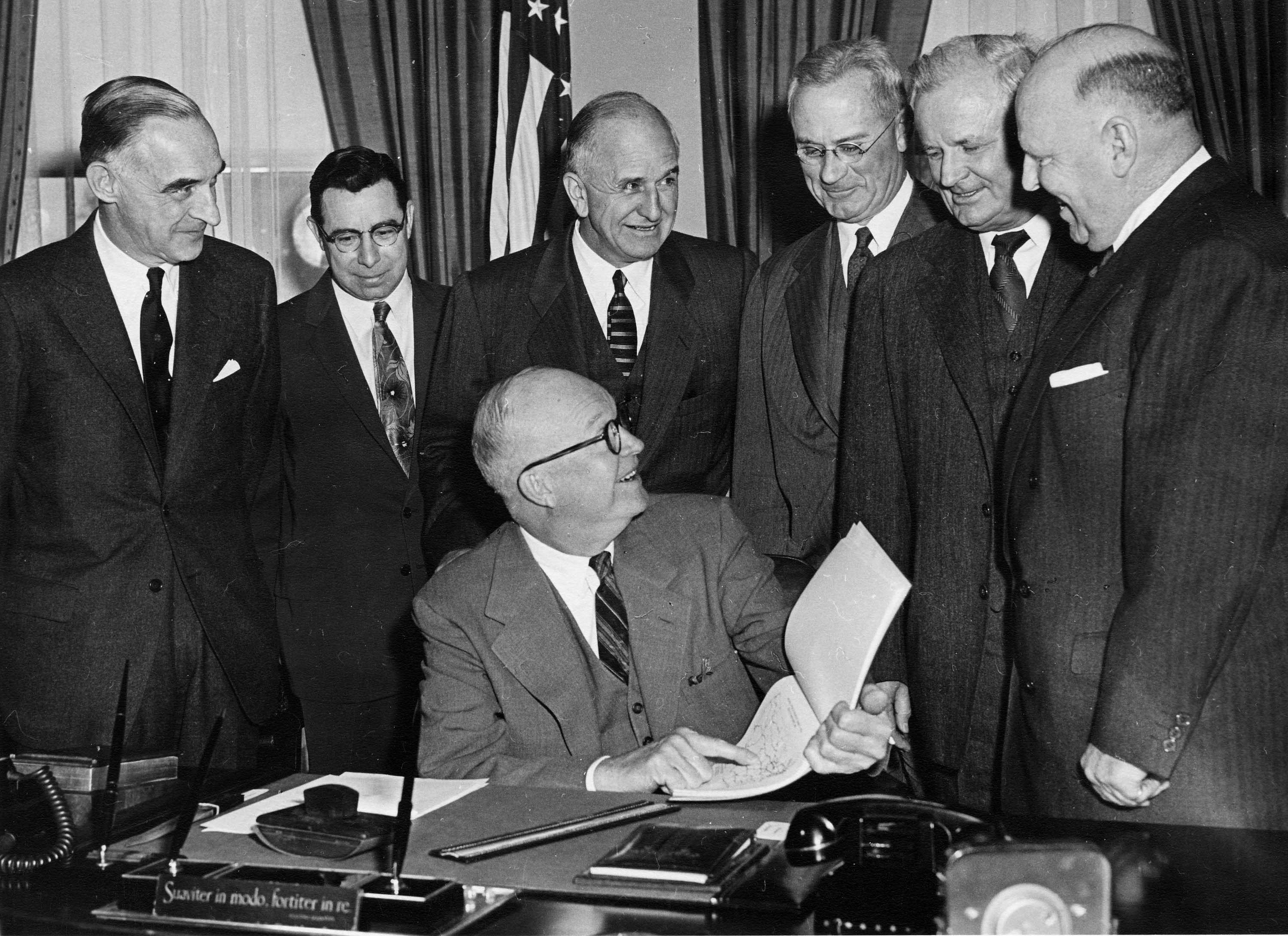
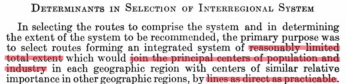
An exogenous planning shock?
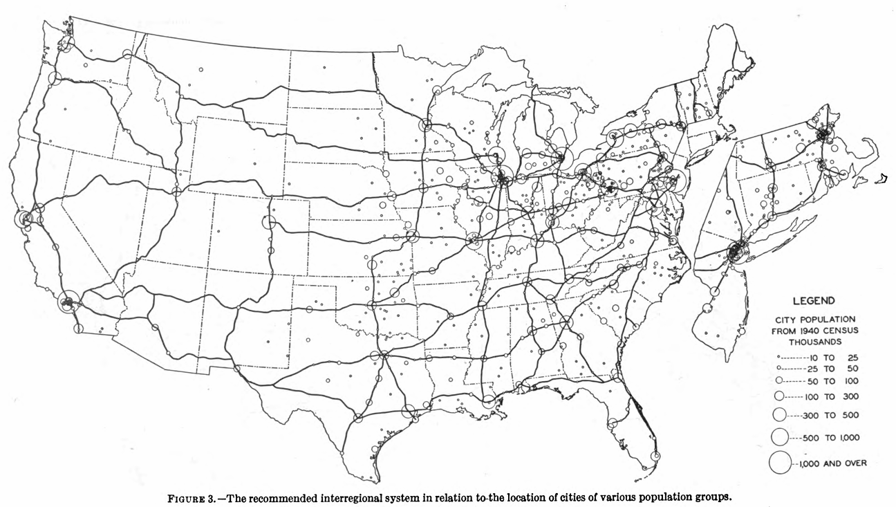
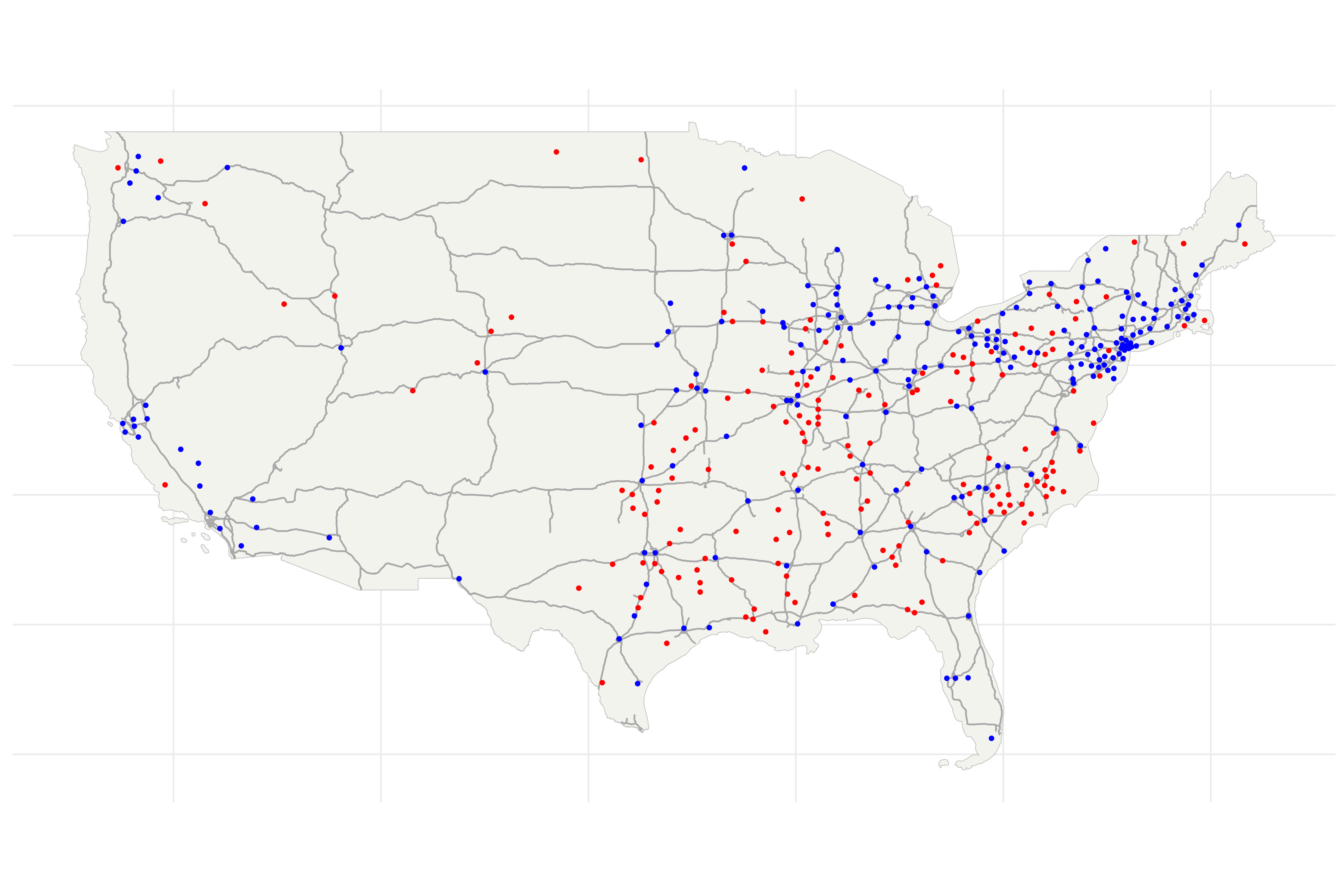
These are excerpts from the 1944 report of the National Interregional Highway Committee, which outlined a plan for the future Interstate system. The section entitled Determinants of Selection describes that, in effect, planners picked dense, productive hubs and drew routes to connect them.
Emphasis on the word Selection! Counties that gained Interstate access were either large and growing or happened to lie along these corridors, making treatment counties systematically different from those left out.
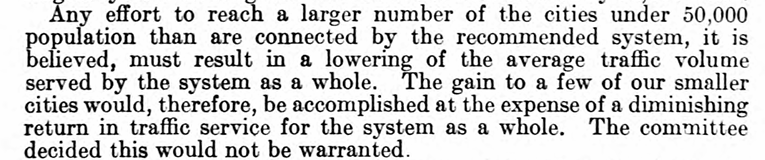
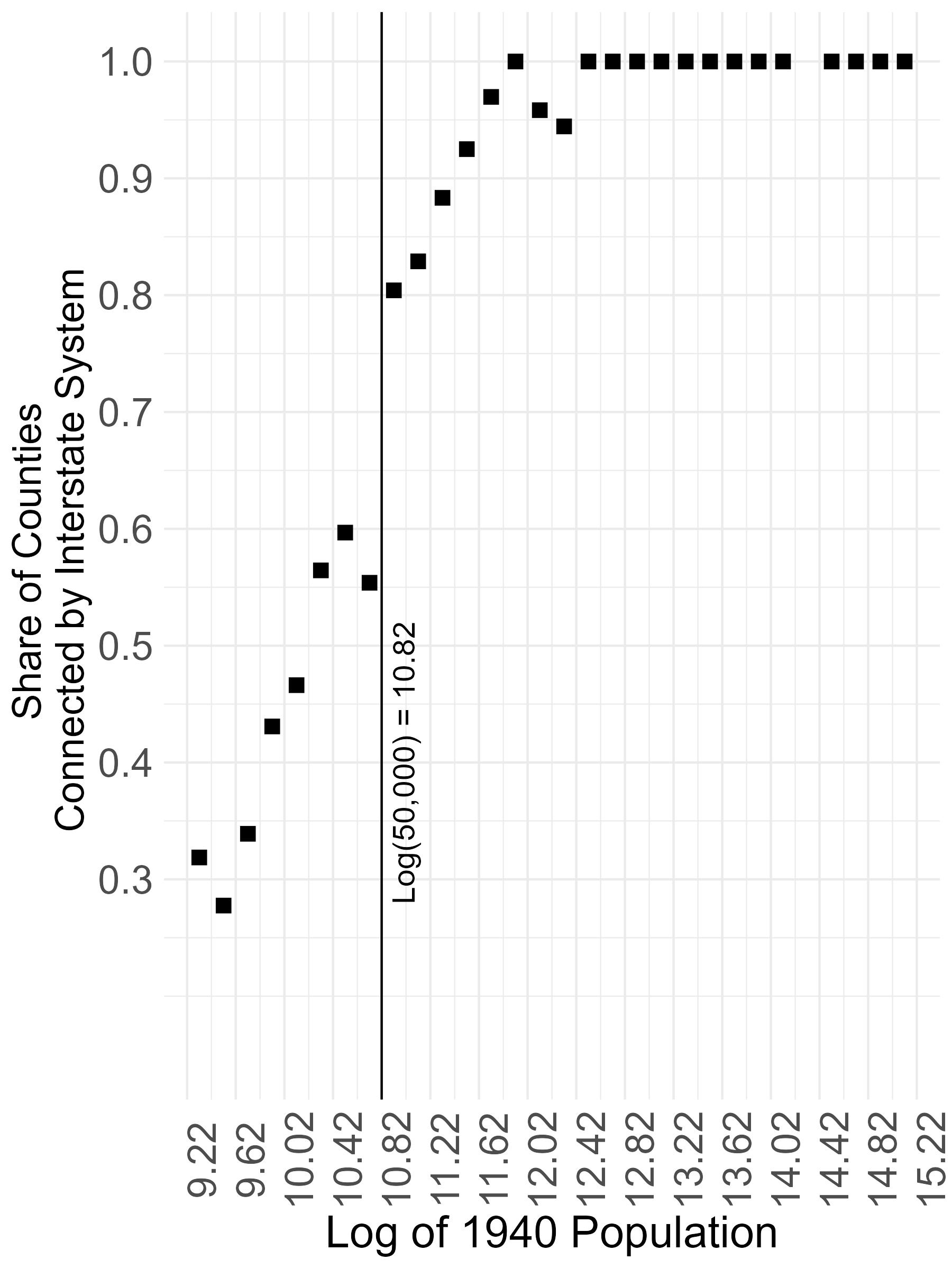
However, the map hints at an arbitrary planning shock. Planners appear to have grouped cities by their 1940 population when drawing networks, and the final plan emphasized connecting cities with populations above 50,000.
Testing for a Discontinuity
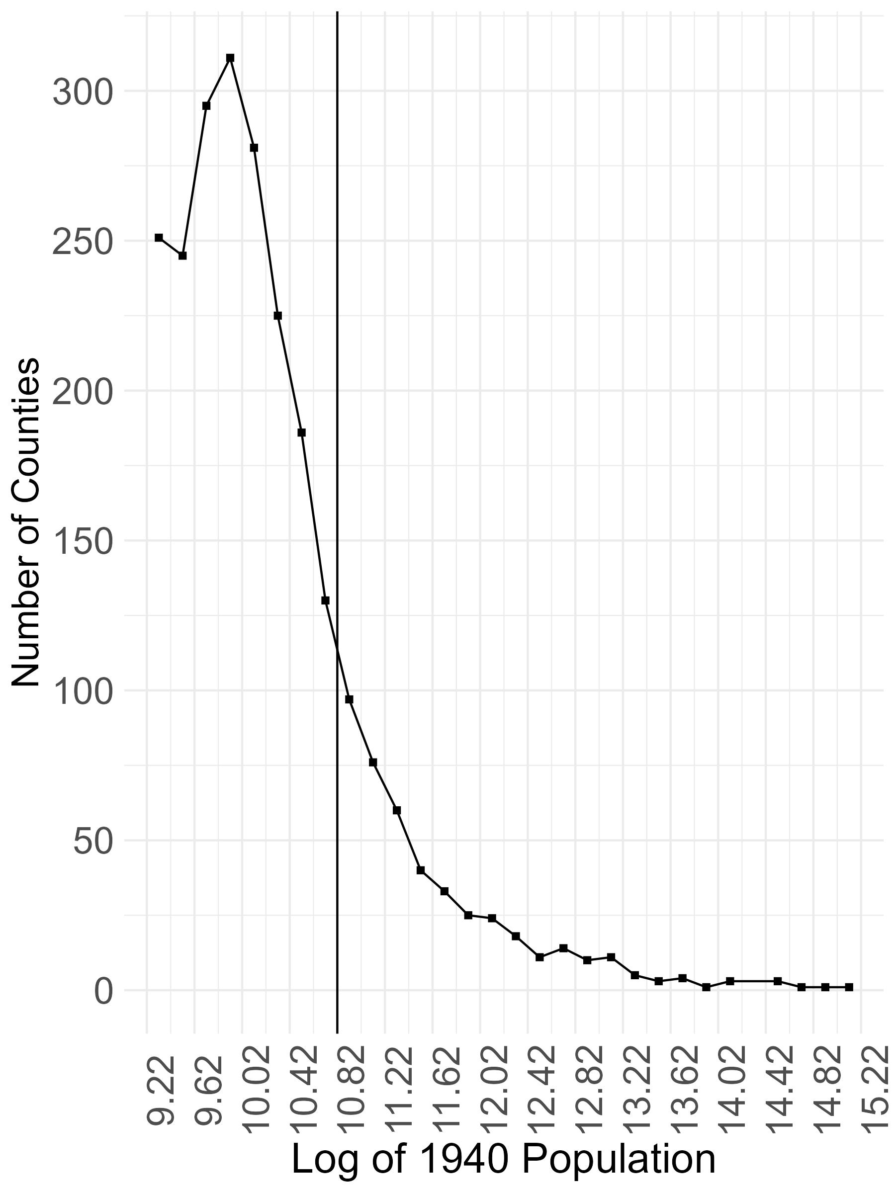
I overlay county boundaries from the 1940 Census with the Interstate system. Then, within bins of the log 1940 population, I compute the share of counties intersected by a highway. The probability of receiving an Interstate jumps by about 20 percentage points at the 50,000 population cutoff.
Additionally, other county characteristics and the density of counties remain smooth at this cutoff, which suggests that this is a natural experiment. Near the cutoff, there is a set of counties that shared similar potential outcomes, on average. However, for a random reason, only some of them gained Interstate access. This looks like a promising fuzzy RD design but, because it uses only counties near the cutoff, estimates are too underpowered to learn anything. So, what can we learn from this natural experiment?
💡 There is a lot of non-random exposure to this exogenous shock
For many counties, their distance to an Interstate depends partly on the exogenous inclusion of a near-cutoff population hubs to the Interstate network. In this spatial setting, the random inclusion of a county generates treatment variation in other counties that must be traversed to connect it to the network.
But exposure to this source of variation is itself non-random. The instrument I construct builds on this insight: it captures the induced treatment variation and, following Borusyak and Hull (2023), I apply their recentering procedure to isolate the random component.
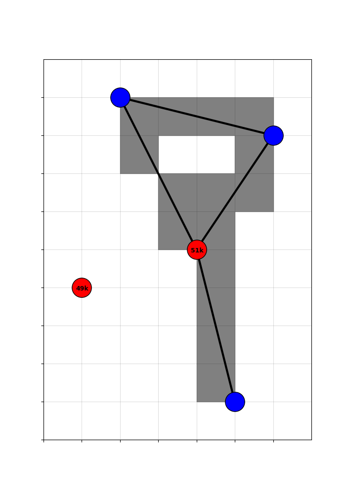
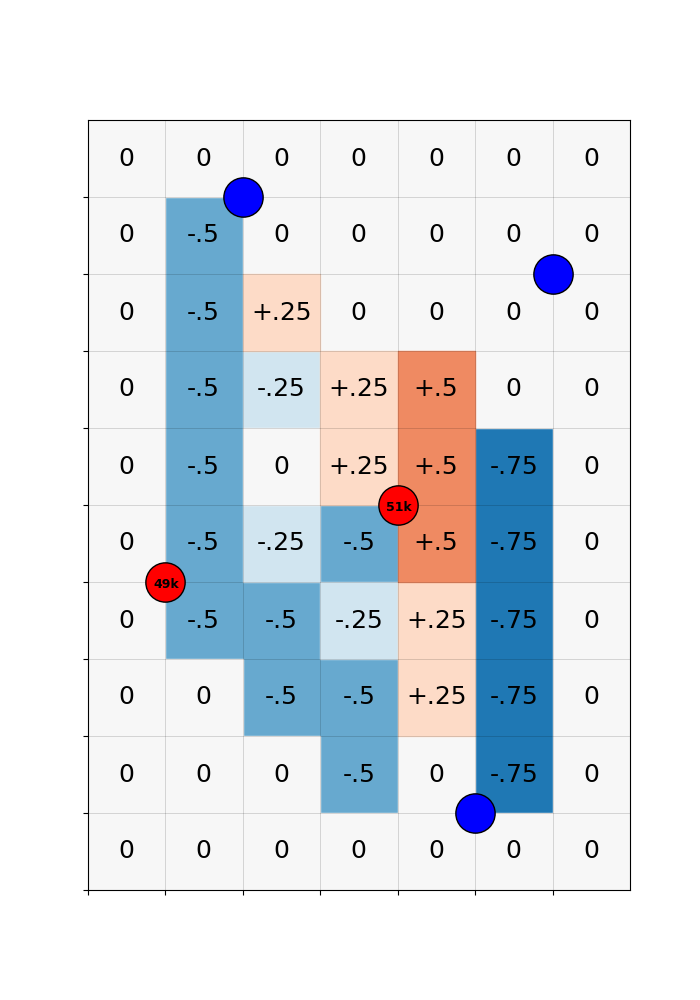
Stylized Example
A visualization of a stylized example will help.
Here are five major population hubs. Three of them, shown in blue, are clearly above the cutoff. The two others, shown in red, have populations close to 50,000.
Imagine a sharp RD: every hub with a population above 50,000 is targeted by planners, and none below that threshold are included. For the red hubs, inclusion is essentially a coin flip: if they have 49,000 residents, they are excluded; if 51,000, they are included.
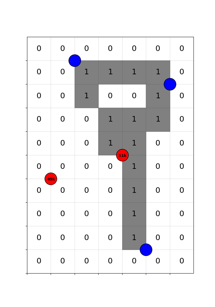
After seeing the populations of the red hubs, planners build this highway network to efficiently connect hubs. Consequently, the grey counties are treated.
Despite the randomness, comparisons of treated and control counties remain confounded by selection. Counties near large, productive hubs - or lying on the corridors between them - benefit from those locations regardless of highways. Also, centrally located counties are always more likely to be traversed, but also gain from centrality alone.
![]()
🔧 Expected treatment captures non-random treatment variation
The treatment combines random variation (from the cutoff-driven coin flips) and non-random variation (from location-advantaged counties always selecting into the treatment group).
The goal, therefore, is to adjust for this non-random selection and recover the random treatment variation generated by the cutoff rule.
To this end, non-random treatment variation is summarized by the expected treatment across networks that could have been built, given the possible connection status of the coin-flip red hubs.
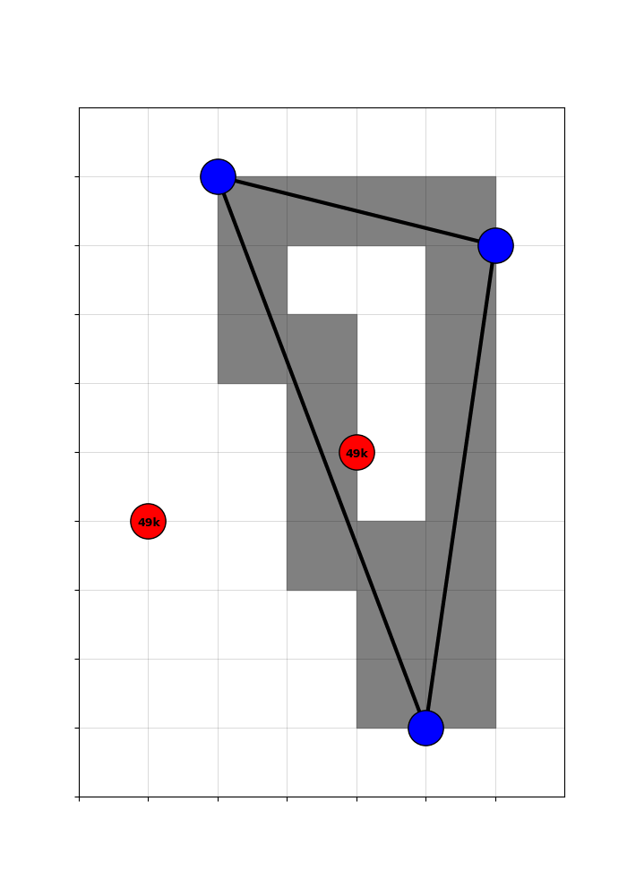
To get the expected treatment, I simulate the four counterfactual networks that could have been built, given the two red coin-flip hubs.
And then take counties’ average treatment across the counterfactuals.
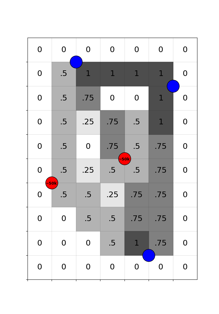
🔧 Recentered treatment captures random treatment variation
By subtracting the expected treatment from the actual treatment, we get a ‘recentered treatment’ that is purged of the systematic component. Variation in the recentered treatment is driven only by the randomness of the cutoff.
Concretely, counties with a positive recentered treatment got a highway only because they happened to be en route to a randomly included hub. Counties with a negative recentered treatment were missed, even though they could have been traversed in plausible counterfactual networks. That is good quasi-experimental identifying variation!
\[\Huge \mathbf{-}\]
\[\Huge \mathbf{=}\]
Constructing a Recentered Instrument for US Counties
I extend this idea to construct a recentered instrument for \(\text{Treatment}_c\), the indicator for a county being within 25km of an Interstate highway.
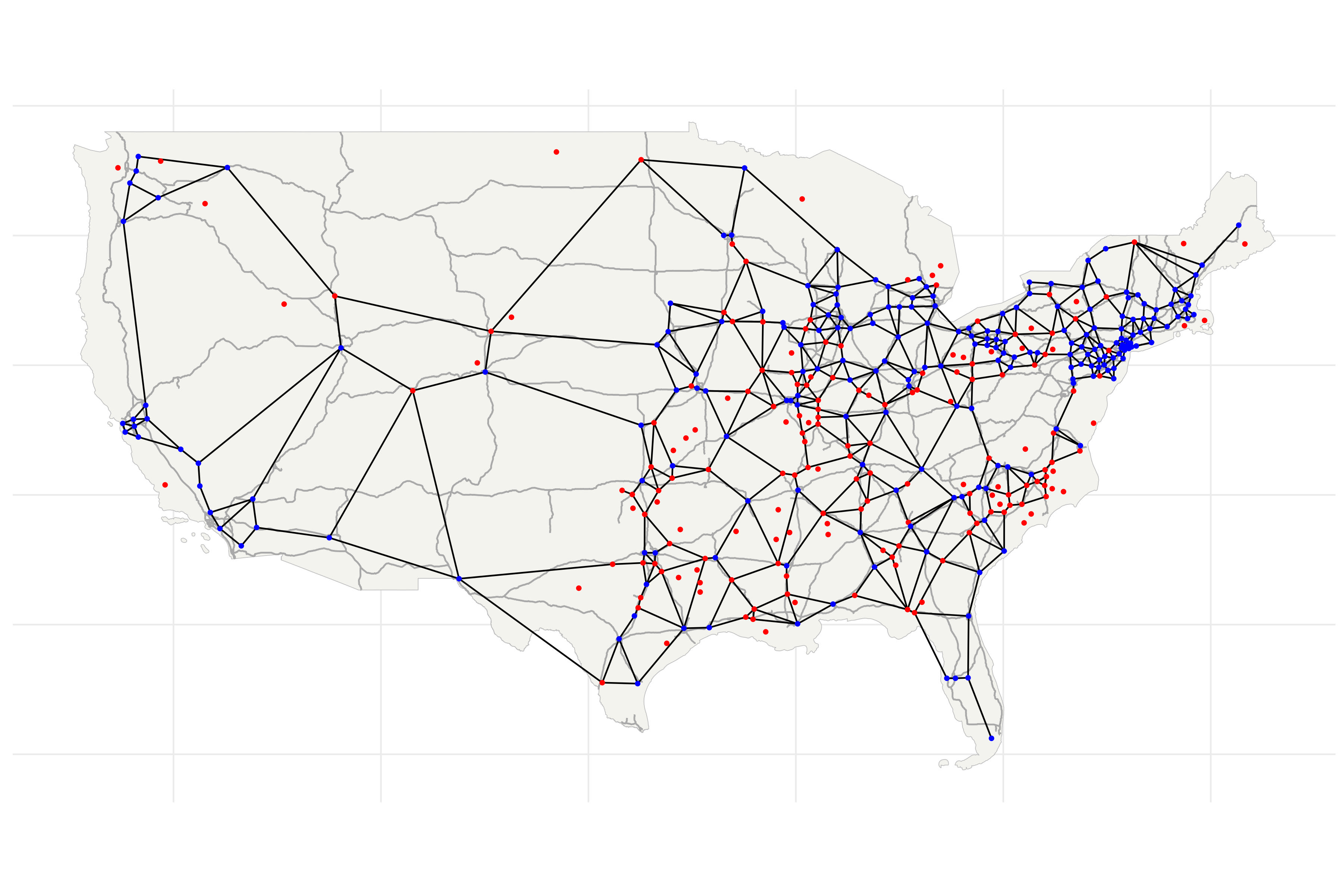
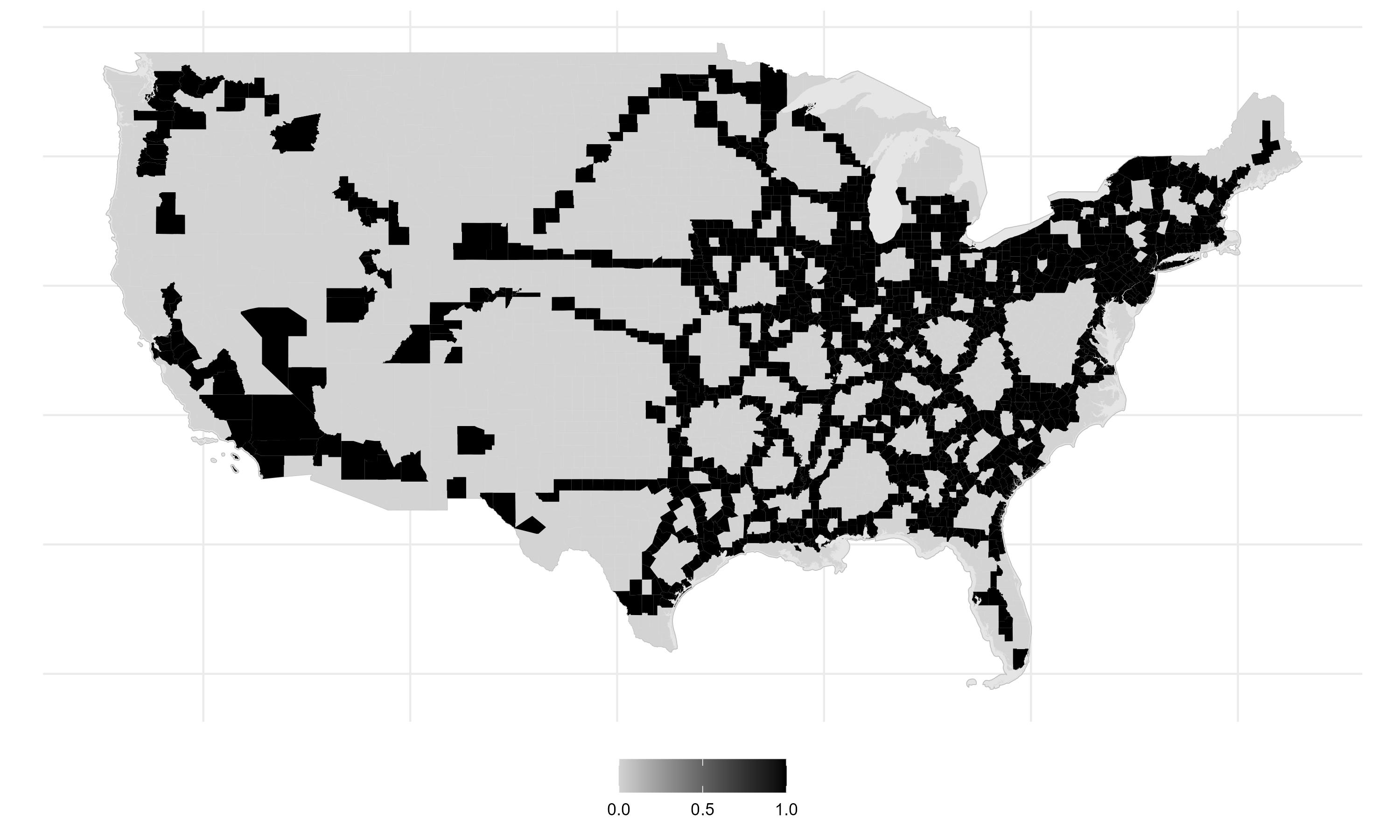
The discontintuity implied a natural experiment; there was a set of counties near the cutoff that were plausibly randomly targeted by Interstate planners. To predict which counties these were, I estimate a probability model that incorporates other planning considerations - such as elevation, surface water, and military/manufacturing importance. The map shows the results of this prediction. Near-cutoff ‘coin-flip’ counties are in red and above-cutoff counties that would have been targeted regardless are blue.
I select red counties that did in fact have populations above 50,000 and draw a straight-line network to connect them. Specifically, I predict an engineer’s optimal network using a proximity graph.
The \(\text{UnadjustedIV}_c\) is an indicator that equals 1 if a county is within 25km of the predicted network (and 0 otherwise). This is analogous to the actual treatment from the stylized example - it is a good predictor of \(Treatment_c\) but the group of counties with \(\text{UnadjustedIV}_c = 1\) contains all the big cities and important corridors.
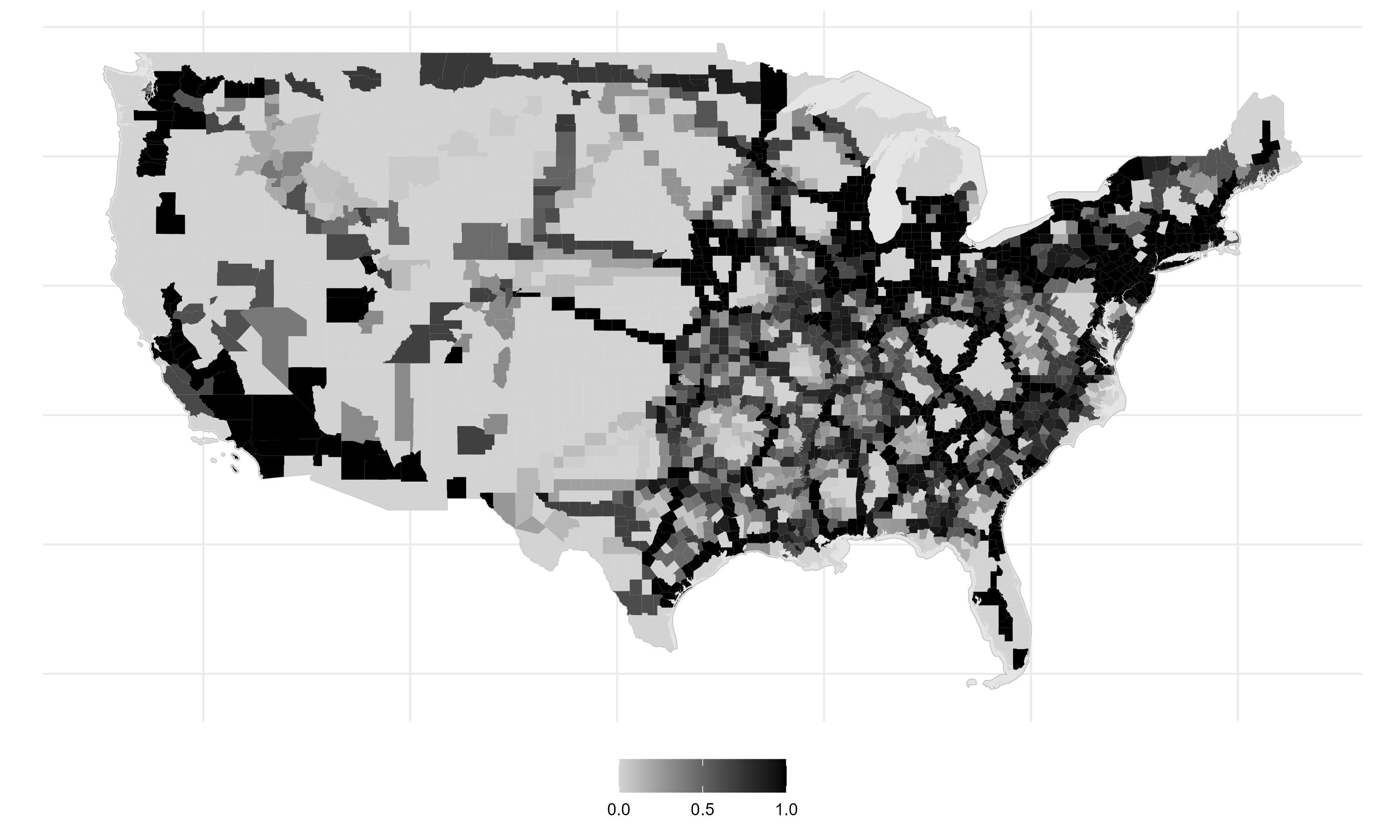
By permuting which red counties get targetted, I simulate 50 predicted counterfactual networks.
The share of predicted counterfactual networks that lie within 25km of a county is the expected instrument.
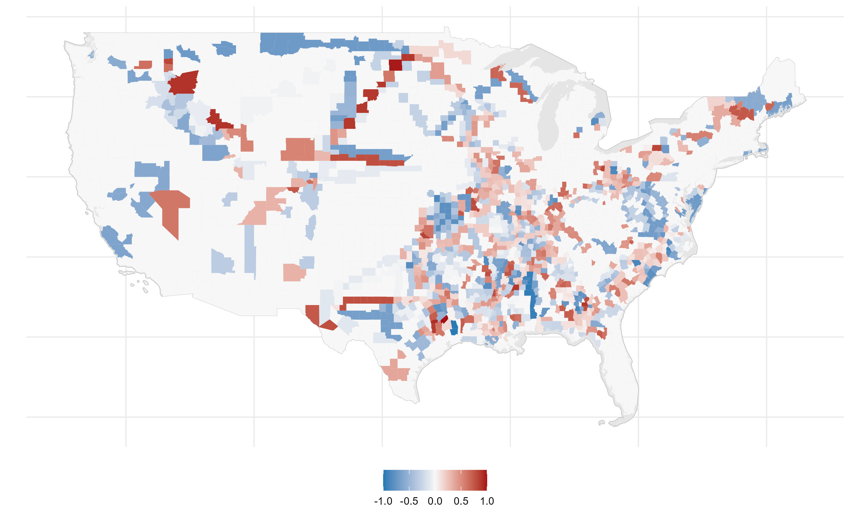
And subtracting the expected instrument from the unadjusted instruments produces a recentered instrument.
In the next section I test that the recentered instrument satisfies the statistical properties of a valid instrumental variable, so that I can use it to correct for selection bias in causal estimates.
Validity of Instrument
First Stage Regression
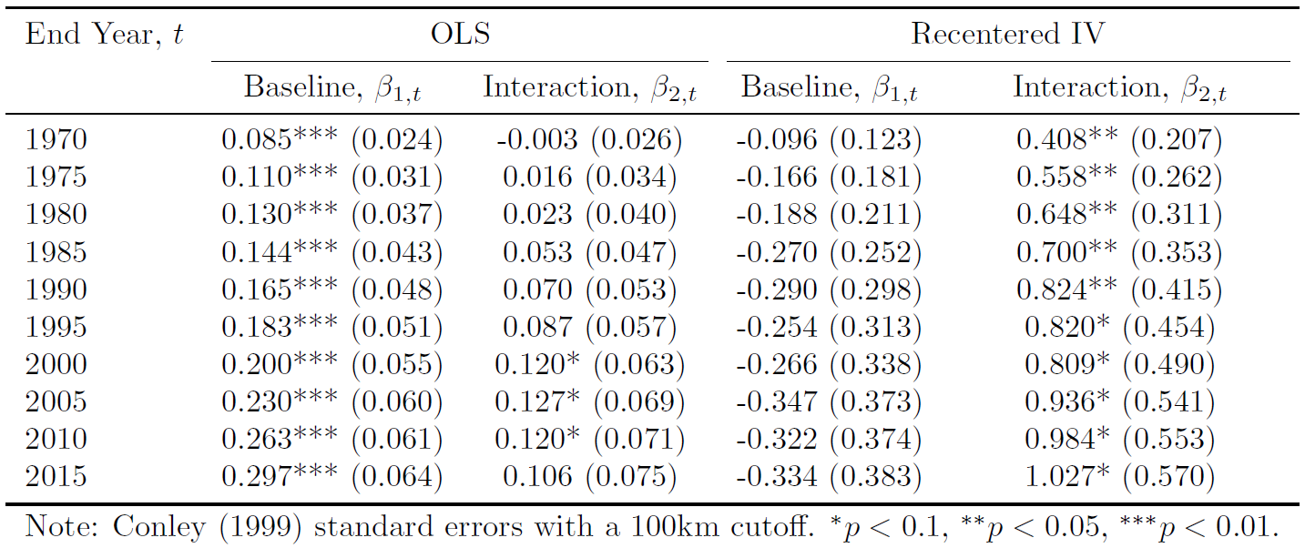
I run the following regression for \(\text{Instrument}_{c} \in \{ \text{UnadjustedIV}_{c}, \text{RecenteredIV}_{c}\}\). \[ \large \text{Treatment}_{c} = \pi_{0} + \pi_{1}\text{Instrument}_{c} + X_{c}\pi_2 + \varepsilon_{c} \]
Column (1) shows that counties with \(\text{UnadjustedIV}_{c} = 1\) are 35 percent more likely to gain Interstate access. The \(R^2\) of 0.12 indicates that the unadjusted instrument explains a meaningful share of treatment status.
Column (3) shows that counties with \(\text{RecenteredIV}_{c} = 1\) are 19 percent more likely to gain access. Focusing only on plausibly exogenous deviations explains about 1.3 percent of the variation in access, yielding an \(F\)-statistic of 37. While the predictive power is limited, this is expected in a design that strips away systematic exposure. Unlike natural experiments that rely on assumptions about counterfactual outcomes, this strategy relies on assumptions about shock assignment. The weak first stage reflects the fact that little in the actual construction process was random—a feature that, if anything, is reassuring.
Testing the exclusion restriction
To interrogate the exclusion restriction, I test for correlatedness between \(\text{RecenteredIV}_{c}\) and counties’ pre-Interstate employment growth, pre-Interstate characteristics, and latitude and longitude.
You can see these regression tables here:
IV Estimates of the Employment Growth Regression
Let’s now revisit our regression model, using the recentered instrument to instrument for \(\text{Treatment}_{c}\)
\[ \log(Y_{c, t}) - \log(Y_{c,1953}) = \beta_{0,\tau} + \beta_{1,\tau}\,\text{Treatment}_{c} + X_{c}\gamma_{\tau} + \delta_{t} + \varepsilon_{c, t} \]
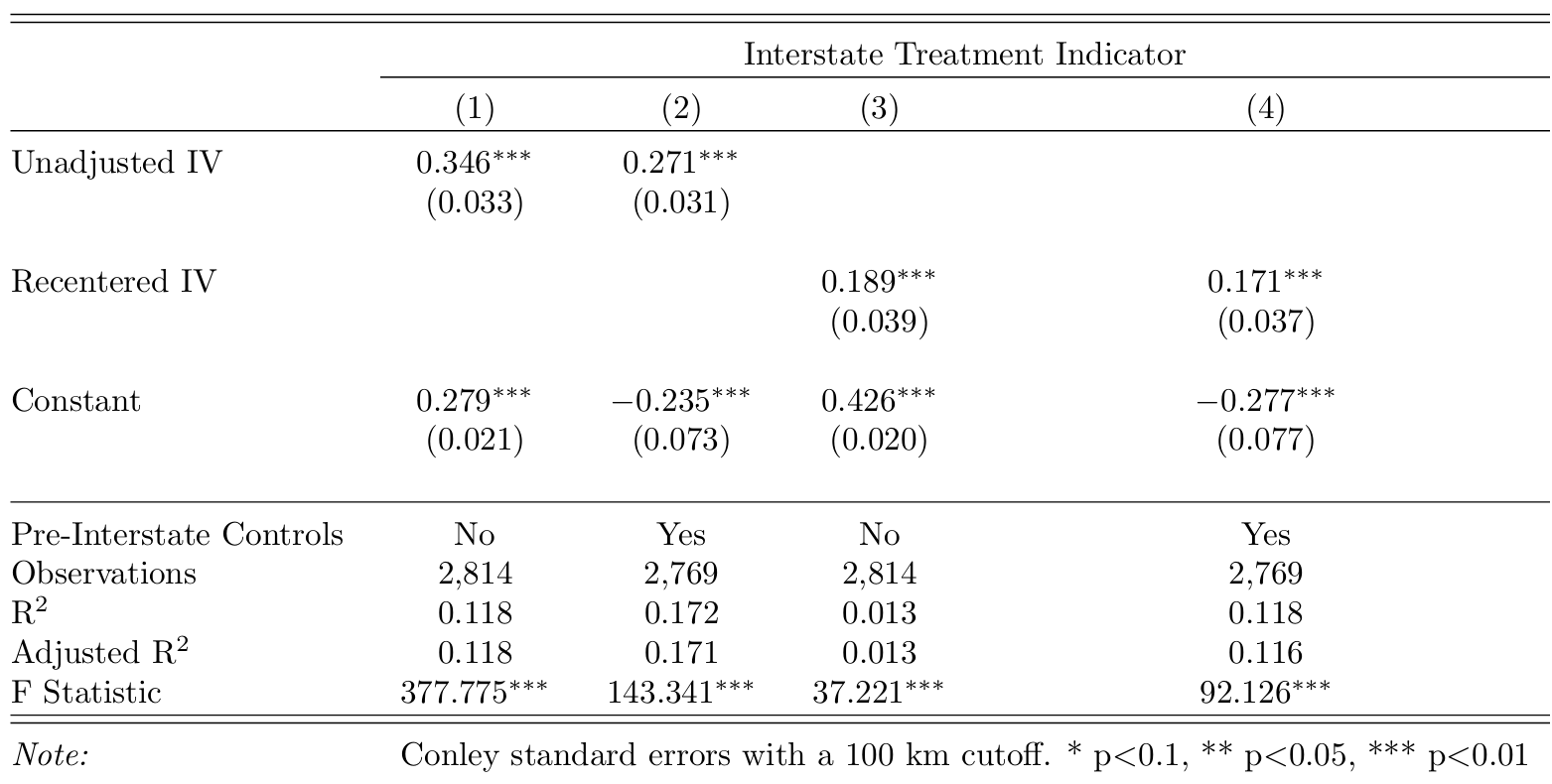
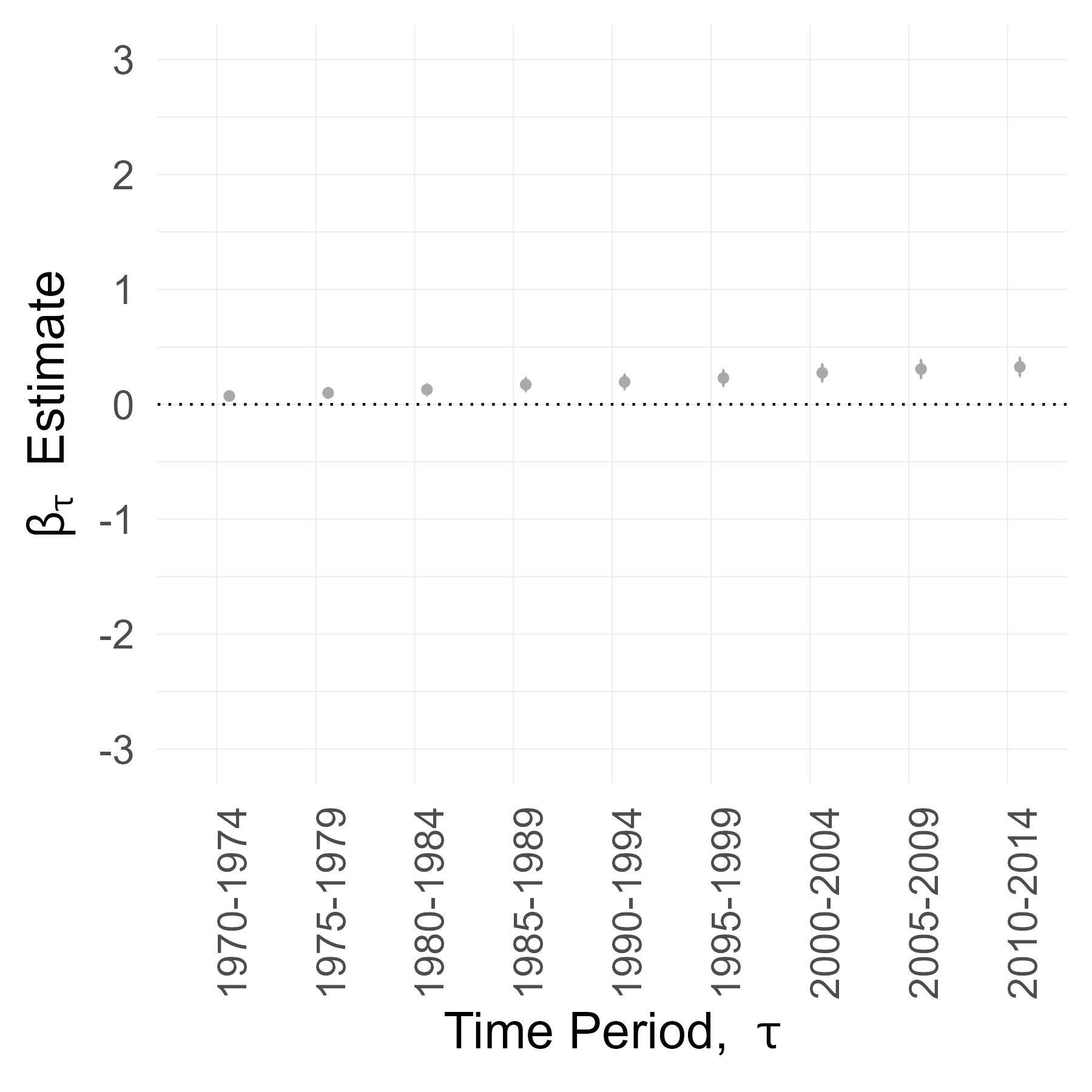
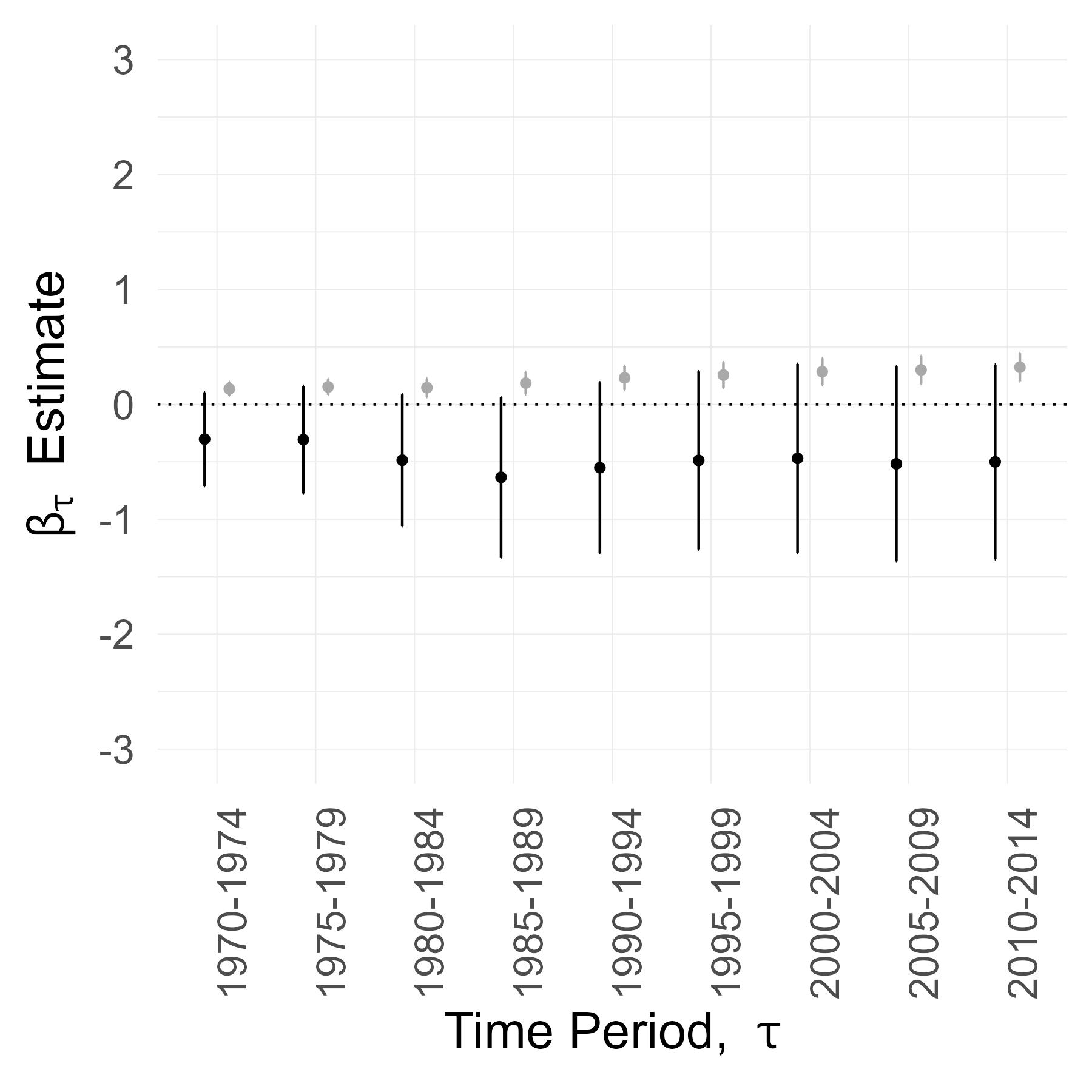
Here are the OLS estimates of \(\widehat{\beta}_{1, \tau}^{OLS}\) and their 90% confidence intervals. They capture the correlation between Interstate access and employment growth and correspond to the earlier table.
I then use \(\text{RecenteredIV}_{c}\) to instrument for \(\text{Treatment}_{c}\). Here are the 2SLS estimates of \(\widehat{\beta}_{1, \tau}^{IV}\) and their 90% confidence intervals. The size of these confidence intervals is pretty disappointing. While the IV point estimates generally exceed the OLS point estimates, we can’t learn much from this. Specifically, we cannot reject the hypotheses that \(\widehat{\beta}_{1, \tau}^{IV} = \widehat{\beta}_{1, \tau}^{OLS}\) or \(\widehat{\beta}_{1, \tau}^{IV} = 0\).
Why are the confidence intervals so wide? One reason, of course, is that the 2SLS estimator uses less treatment variation to estimate the coefficient. However, there’s another reason. For every period \(\tau\), the regression uses the same number of observations (N = 13,845 = 2769 counties \(\times\) 5 years). But the confidence intervals get wider in later periods. This tells me that the uncertainty around \(\widehat{\beta}_{1, \tau}^{IV}\) is not just sampling variation, but genuine heterogeneity.
Perhaps, the confidence intervals widen over time because counties gaining Interstate access through the natural experiment do not follow a single growth trajectory, and instead diverge in their long-run outcomes.
I examine reasons why counties may evolve differently in response to Interstate access and the one that stands out is the pre-Interstate dependence on agriculture.
I use historic Census occupation counts to compute a primary sector share of employment in 1950. In practice, primary sector labor is mostly agricultural so I use this as a proxy for counties’ agricultural share of employment.
Here are the \(\widehat{\beta}_{1,\tau}^{IV}\) and \(\widehat{\beta}_{1,\tau}^{OLS}\) estimates for counties where the primary sector accounted for more than 20% of employment in 1950.
And here are the \(\widehat{\beta}_{1,\tau}^{IV}\) and \(\widehat{\beta}_{1,\tau}^{OLS}\) estimates for counties where the primary sector accounted for less than 20% of employment in 1950
This suggests that, for counties situated between larger population hubs, Interstate connection increased local jobs only if agricultural employment was substantial beforehand.
In the following section, I test for and examine this heterogeneity further.
All Counties
All Counties
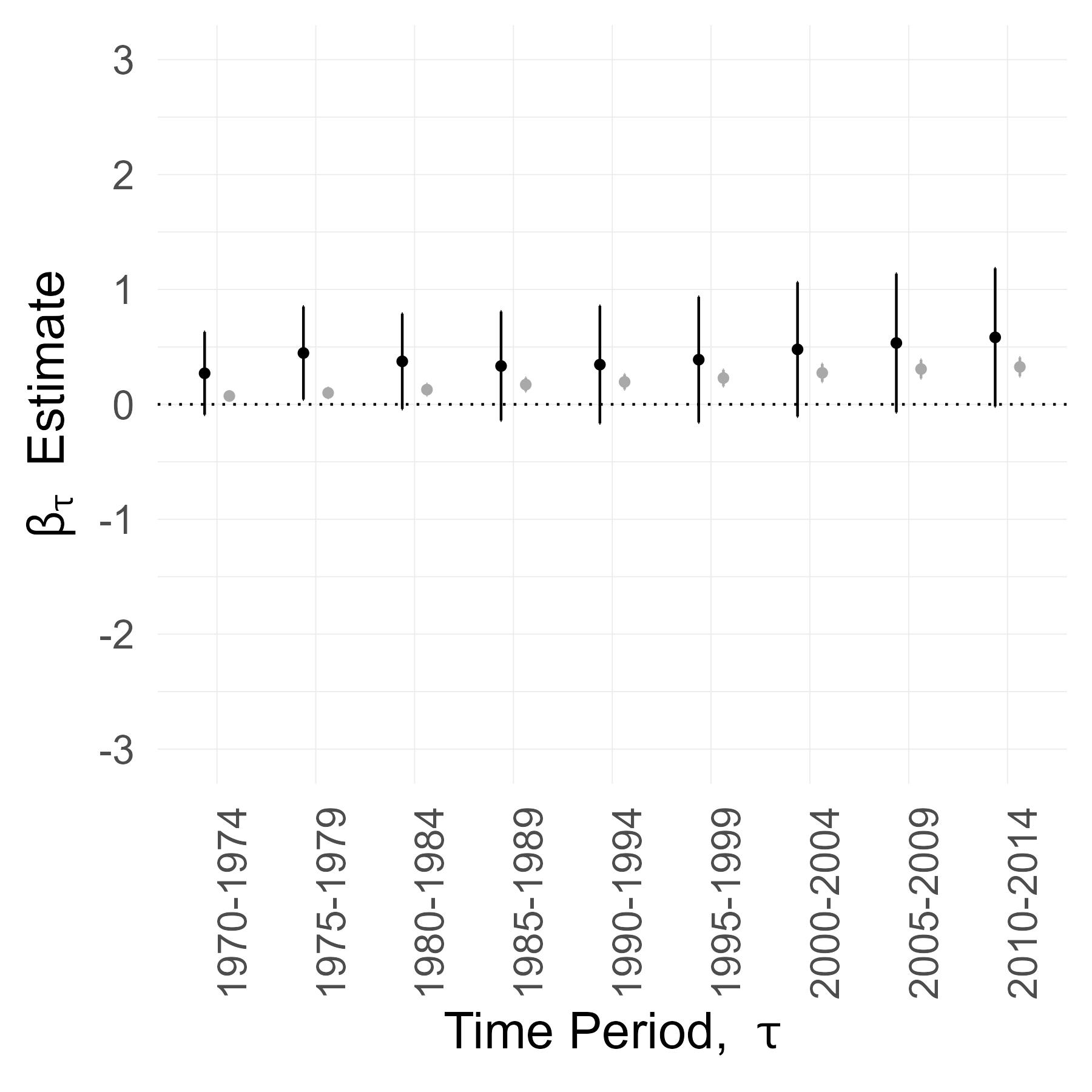
High Agriculture Counties
Low Agriculture Counties
Heterogeneity Across Agriculture Dependence
Splitting the sample into high vs low agriculture groups suggested an effect heterogeneity but, to formally test for this and to more closely examine the dynamics, I set up a different regression specification.
To capture dynamic effects with total flexibility, I estimate a separate regression for each year \(t \in \{1970, ..., 2016\}\) For each year \(t\), I estimate the following specification, with counties indexed by \(c\):
\[
\log(Y_{c, t}) - \log(Y_{c,1953})
= \beta_{0,t} + \beta_{1,t}\text{Treatment}_{c} + \beta_{2,t} ( \text{Treatment}_{c} \times \text{High Ag}_{c}) + \beta_{3,t}\text{High Ag}_{c}
+ X_{c}\gamma_{t} + \varepsilon_{c, t}
\]
❔ How is this different?
This differs from fitting the previous regression separately for high- and low-agriculture groups because:
I estimate coefficients separately by year, so each regression uses N = 2,769 counties.
\(\gamma_{t}\), the weight on pre-Interstate characteristics, can now vary by year \(t\) rather than being fixed within each period \(\tau\).
The regression produces estimates and standard errors for \(\beta_{2,t}\), enabling a formal hypothesis test for heterogeneity across agriculture dependence.
To use \(\text{RecenteredIV}_{c}\), I check that the first stage is strong and that the exclusion restriction holds for the interacted instrument.
Here are the coefficient estimates for some of the years \(t\). \(\beta_{1,t}\) captures the effect of Interstate access on employment growth between 1953-\(t\) for low agriculture counties. \(\beta_{1,t}+\beta_{2,t}\) captures the same for high agriculture counties.
The \(\beta_{1,t}^{OLS}\) coefficients start small and increase steadily over time, consistent with the growth we saw in the raw data plot. In contrast, \(\beta_{2,t}^{OLS}\) remains close to zero, indicating that the treatment–control gap is similar across the high- and low-agriculture subsamples.
The Recentered IV columns report the 2SLS estimates and reflect a local average treatment effect of Interstate access. The \(\beta_{1,t}\) coefficients remains close to zero, which implies that, in this natural experiment, Interstate access had no effect on employment growth in low-agriculture counties. The entire effect is concentrated in high-agriculture counties, corresponding to positive and significant \(\beta_{2,t}\) estimates.
Furthermore, \(\beta_{2,t}\) starts at a high magnitude and increases rapidly over the years. This suggests that in high-agriculture counties there was a big, short-run impact on employment growth that persisted and, perhaps, spurred agglomerations.
Possible explanations for this heterogeneity
One possibility is that Interstate access accelerated industrialization in counties that were initially dependent on agriculture. Alternatively, lower transport costs may have reinforced agricultural specialization rather than diversification.
I cannot find clear evidence for Interstates inducing big sectoral shifts. We would need more statistical power to identify the causal effect on sector shares. However, simple treatment–control comparisons show similar long-run declines in primary-sector employment across groups. Interstate access did not appear to accelerate the transition out of agriculture.
If Interstate access made high-agriculture counties grow larger, but not more industrial, a plausible explanation for this heterogeneity is that farm-related jobs are less mobile. Farms are more likely to remain local after transport costs fall, whereas factories or offices can relocate more easily toward denser areas.
| Treatment Counties | Control Counties | |
|---|---|---|
| Primary sector share 1950 | 0.39 (0.0052) | 0.44 (0.0037) |
| Primary sector share 1990 | 0.07 (0.0023) | 0.12 (0.0026) |
| Change in primary share 1950–1990 | -0.31 (0.0046) | -0.32 (0.0033) |
🔍 Summary
Since the system’s construction, employment has become more concentrated in counties connected to the Interstate network. On average, employment growth has been about one-third higher in counties with Interstate access than in those without.
Of course, highways were not placed at random. The Interstate system was planned to connect metropolitan areas, so this comparison reflects selection bias. These trajectories could be driven by concurrent forces of urbanization rather than by Interstate access itself.
From Interstate planning documents, I discover an overlooked natural experiment and discern that many counties were non-randomly exposed to this exogenous shock to Interstate access. Adapting Borusyak & Hull’s (2023) recentered instrument framework, I use predicted counterfactual networks to isolate quasi-experimental variation from this planning shock.
I find that, among counties between major population hubs that as-good-as-randomly gained access, Interstates increased employment only where agriculture was initially important.
Hello - thank you for visiting this site!
My name is Charoo Anand and I’m a PhD candidate at Berkeley Econ, on the job market for data scientist/economist roles.
You can reach me at charoo_anand [at] berkeley.edu or on LinkedIn.